Working with PowerPoint Charts in 2013
In this article ( for beginners) we will show you how to insert PowerPoint charts in version 2013 on your slides and customize it in a step by step way. Charts are an excellent way to show your data visually. It is quite simple to insert and work with charts in PowerPoint.
Insert a chart on slide:
When you open a slide with ‘Title and Content’ layout, you will find an icon for chart in the content placeholder.
When you click on the icon the following menu opens up with a list of different types of charts available:
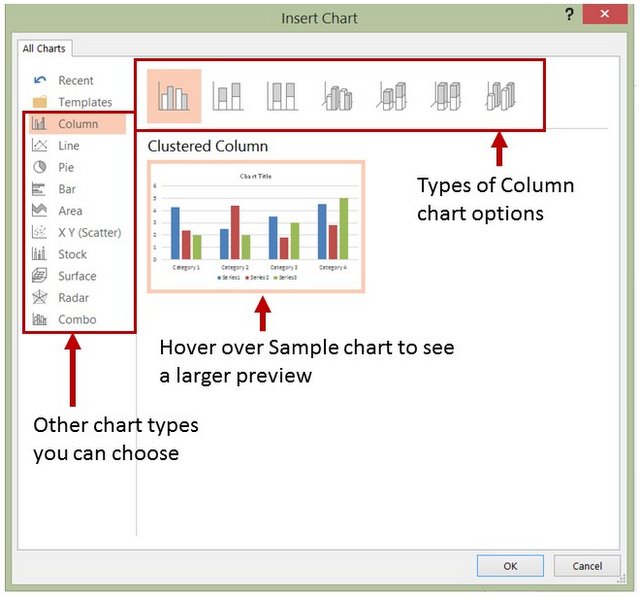 Menu showing types of charts
On the pane, you can see a sample chart which enlarges when you hover your cursor over it. Above the sample chart, you can see the different types of charts that belong to the same category. On the left side of the pane you can see all other categories of charts you can insert on to the slide.
Another way to insert a chart is to go to the ‘Insert’ tab in the PowerPoint ribbon and click on the ‘Chart’ icon in Illustrations group:
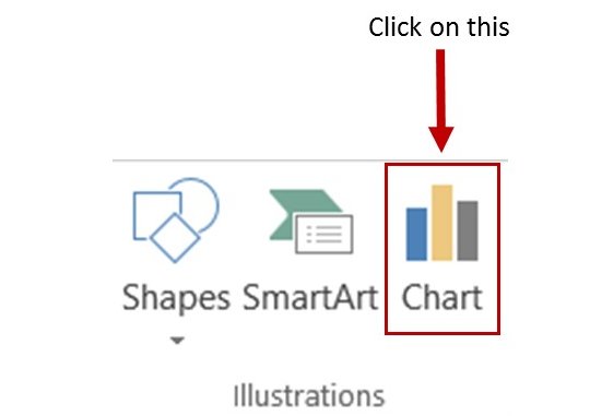 Add PowerPoint Chart from Menu
When you click ‘OK’ after selecting the category and type, a sample chart gets added. PowerPoint defaults some data as well. We added a column chart and the default column chart looks like this:
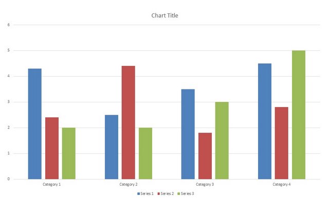 Default Column Chart
Editing Data:
To edit the default data and customize the chart, right click on the chart and go to ‘Edit data’ option. This opens two alternatives for you as shown below:
 Edit Chart Data
You can choose to ‘edit data’ from the embedded worksheet or you can choose to edit data using Excel 2013.
 Data Worksheet in PowerPoint
Understanding the data worksheet:
The data worksheet that opens up is formatted as ‘Table’ by default. This means, when you add more categories and series to the data, the chart gets automatically updated with additional data.
You can copy data from an Excel worksheet and paste it in place of the default data provided in the worksheet. To expand the selection range, you click on the lower right corner of the table selection, indicated by blue line. The cursor will turn into a double headed arrow. Now, you can drag the selection to include the cell range you want.
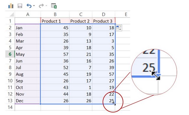 Selected Data Range
The same way, you can reduce the area of selection to show just a few of the columns or rows in the chart. Remember, the chart will only show the data enclosed by blue lines. You can close the worksheet to resume to the slide. The content is automatically saved.
Change the layout of the chart:
You don’t have to settle for the default chart layout. When you click on the chart and go to ‘Design’ tab in PowerPoint ribbon, you will find an option called ‘Quick Layout’. When you click on the drop down menu, you will find multiple layout options to choose from:
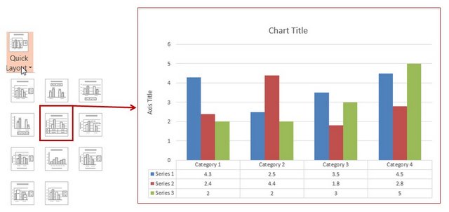 Quick layout for charts
Change Chart Style:
You can improve the look and feel of your chart by applying one of the chart styles provided by PowerPoint. The change the style of your chart, click on the chart and go to the ‘Design’ tab. You will find a number of chart style options to choose. When you hover your mouse over each of the styles, you can see a preview of the style on the chart.
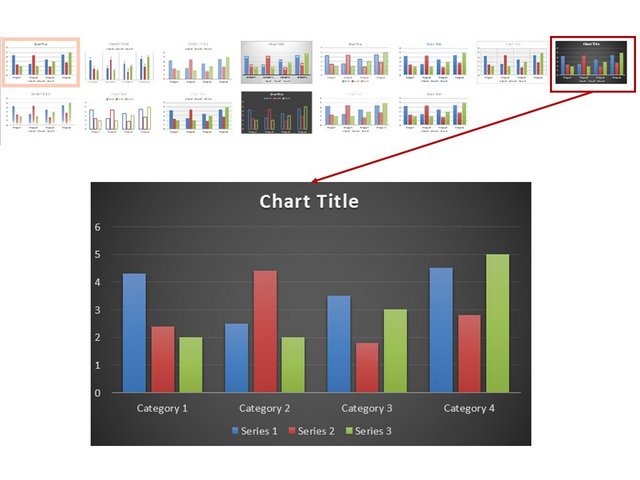 Chart Style Option
Those are some of the essential details about inserting a chart in PowerPoint 2013. We will explore more about using PowerPoint charts in this section.
A useful resource for business presenters:
While charts are useful for data visualization, you need diagrams and graphics for concept visualization. If you are business presenter, you may not have the time to create high quality graphics and diagrams from scratch.
That is why we came up with our Visual PowerPoint Graphs Pack collection. The pack has 320+ editable charts. Just choose the template that suits your requirement and edit data. Your business slides get ready in no time. Creating professional quality business slides has never been easier.
Why waste time creating data-driven graphs from scratch when you have such a high quality solution available off the shelf?
Please note: The graphs pack is hosted and sold through our other site Presentation-Process.com. The contents of the pack are created completely inhouse by the same team that owns All PPT Templates.
We hope you found this article useful. If so, please share this article with your friends and leave your comments below
Related Posts
Top of Page : PowerPoint Charts
Main PowerPoint Tutorials Page



New! Comments
Leave me a comment in the box below.